Skip to content
Kainat Waseem

Identity

Field & Co

Client
Field & Co
Role
Identity, Packaging, Web
Year
2026
Category
Identity
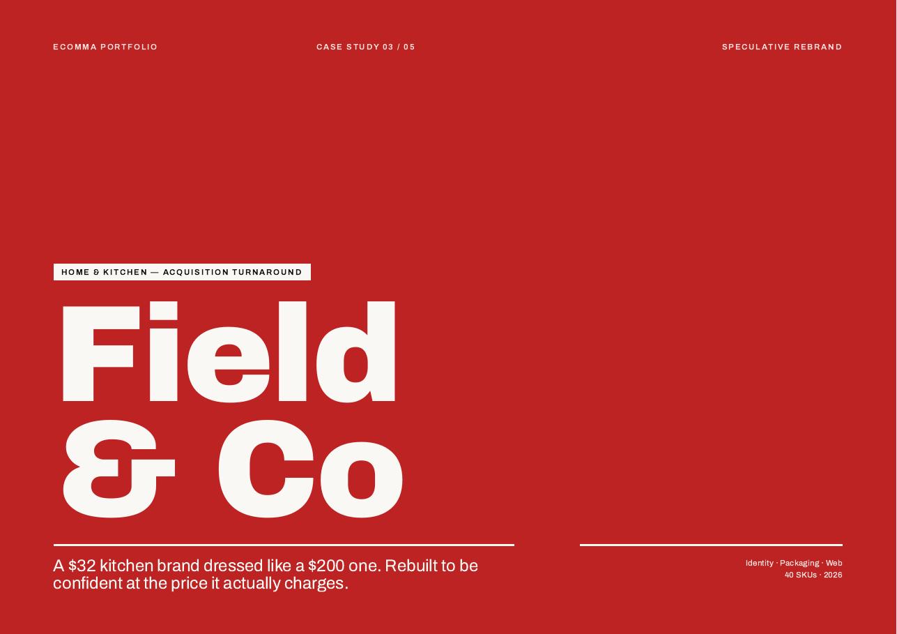
Field & Co case study cover — home & kitchen — acquisition turnaround

Overview

A $32 kitchen brand dressed like a $200 one. Rebuilt to be confident at the price it actually charges.

Challenge

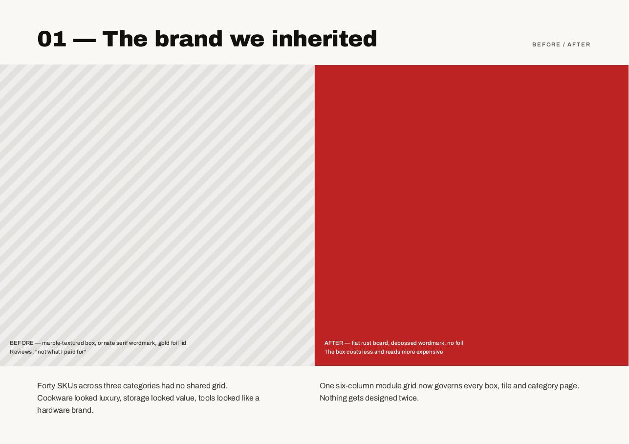
Customers weren't disappointed by the pan — they were disappointed by the promise on the box. Forty SKUs across three categories shared no grid at all.

Approach

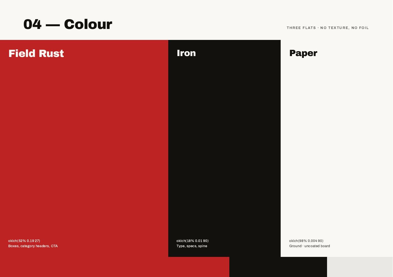
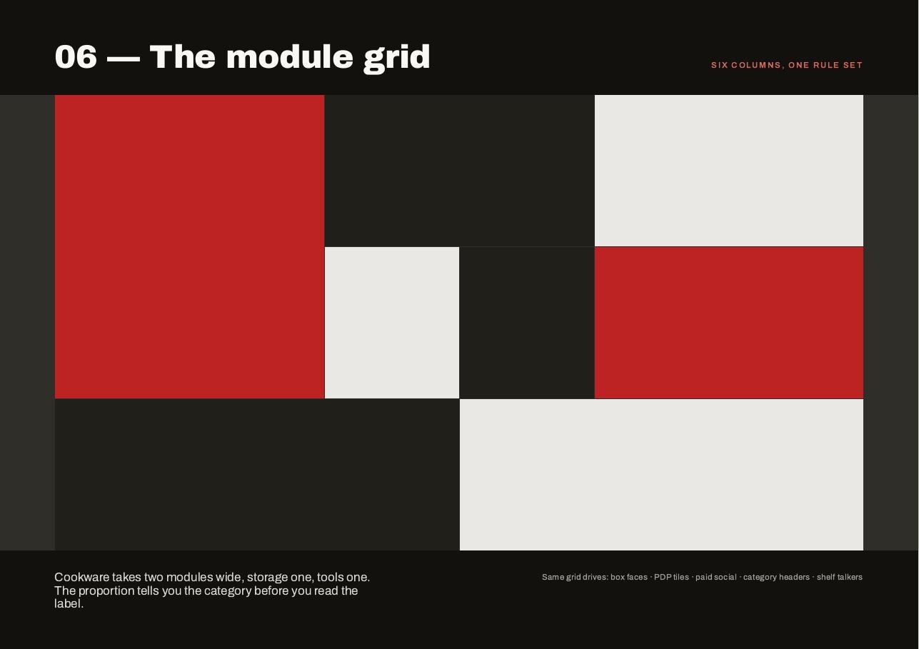
Borrowed luxury removed: flat colour instead of marble and foil, and one six-column module grid governing every box, tile and category page.

Outcome

One rule set across forty SKUs. The box costs less to make and reads more expensive.
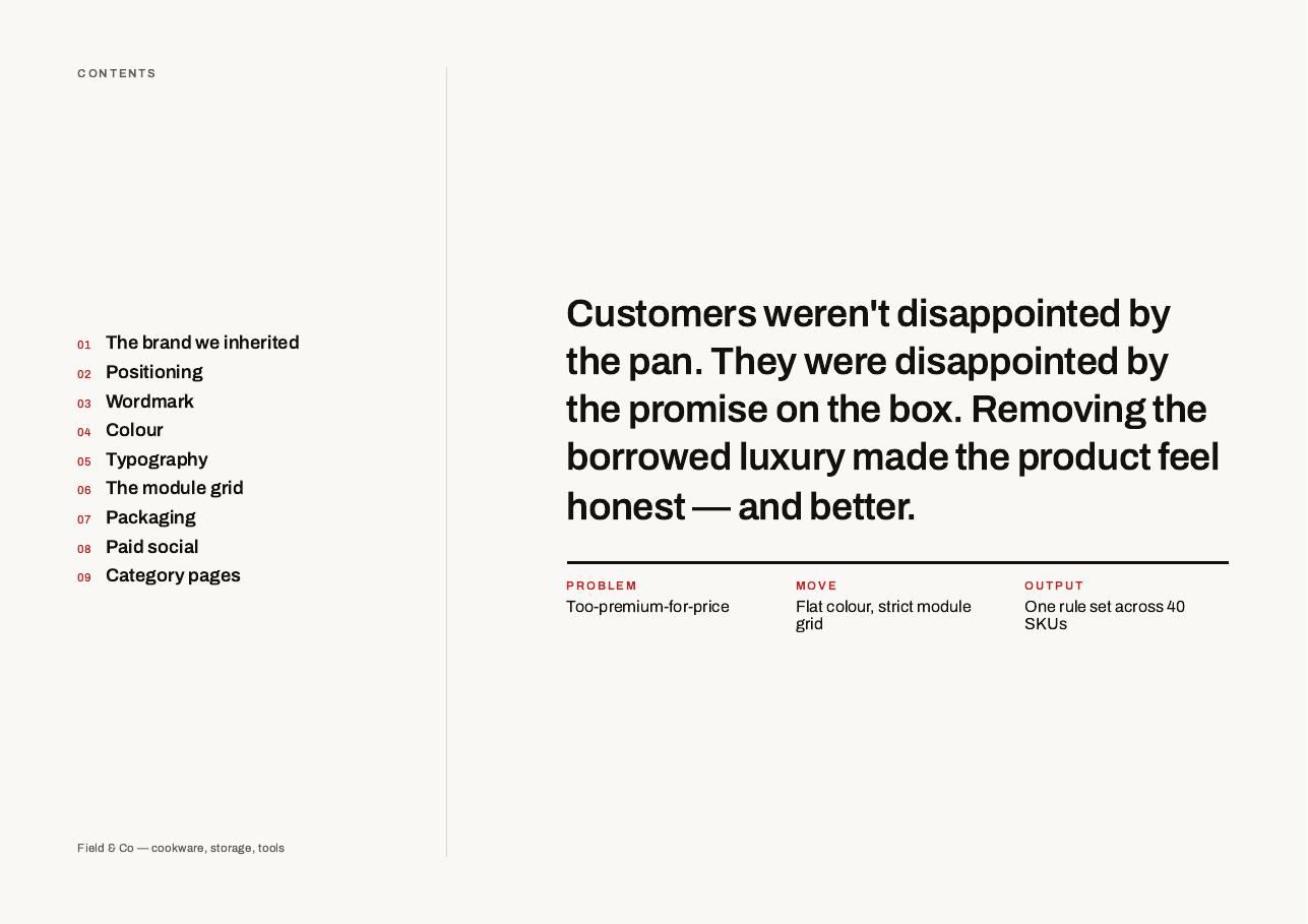
Field & Co deck page 2 — Contents and the one-paragraph brief
Contents and the one-paragraph brief
Field & Co deck page 3 — 01 — The brand we inherited: before and after
01 — The brand we inherited: before and after
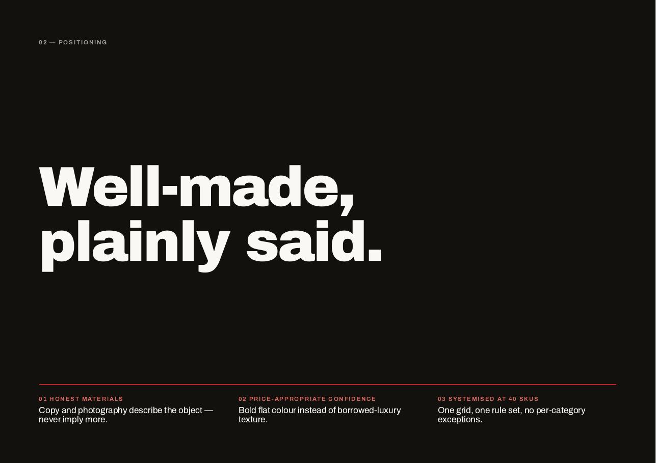
Field & Co deck page 4 — 02 — Positioning
02 — Positioning
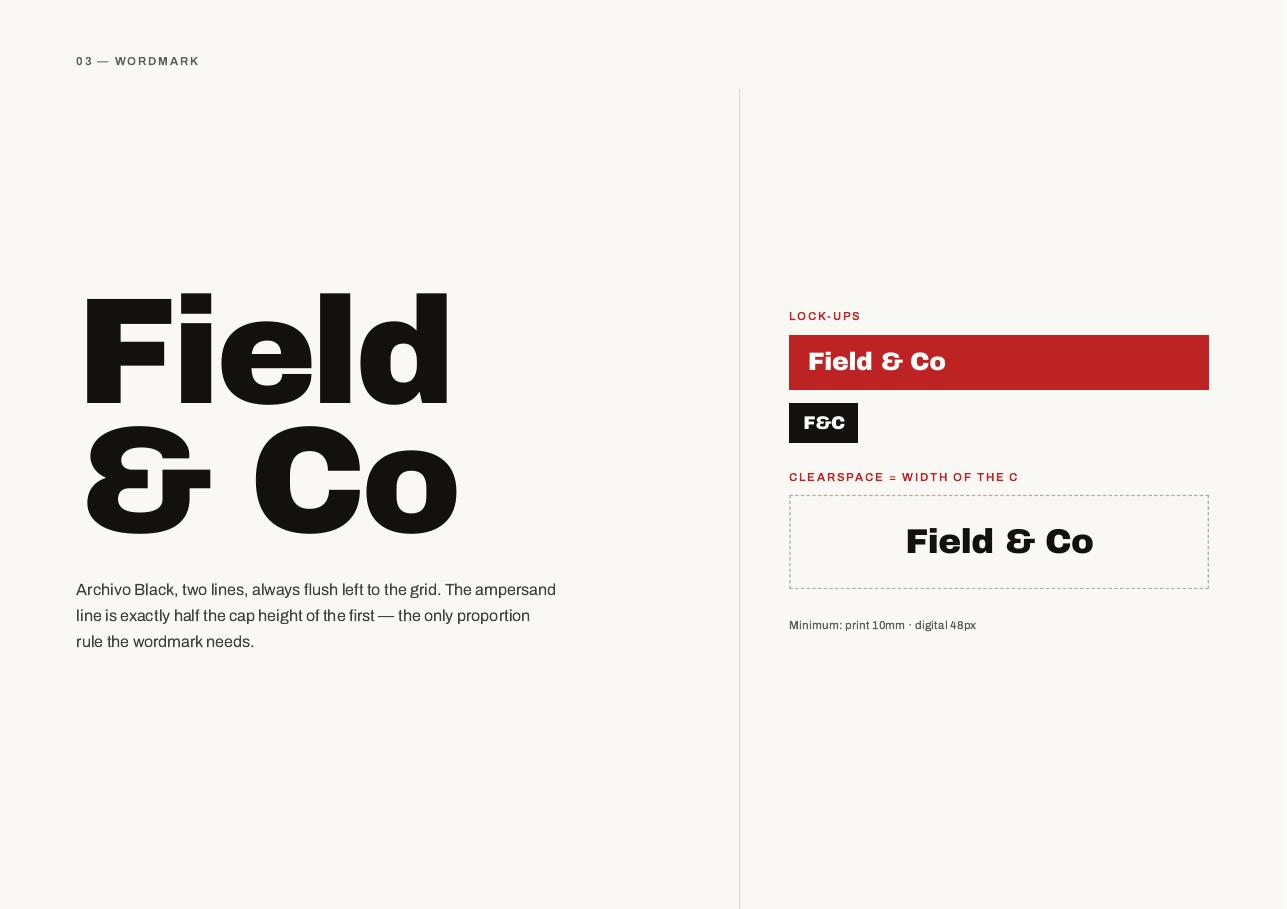
Field & Co deck page 5 — 03 — Wordmark
03 — Wordmark
Field & Co deck page 6 — 04 — Colour: three flats, no texture
04 — Colour: three flats, no texture
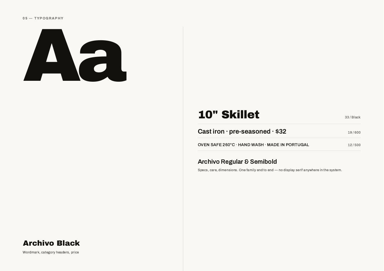
Field & Co deck page 7 — 05 — Typography
05 — Typography
Field & Co deck page 8 — 06 — The module grid
06 — The module grid
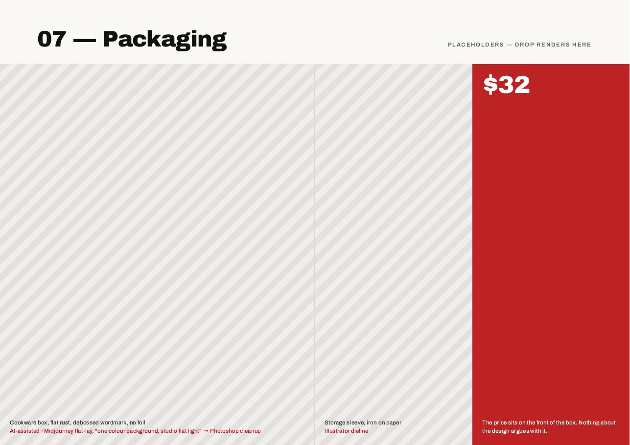
Field & Co deck page 9 — 07 — Packaging
07 — Packaging
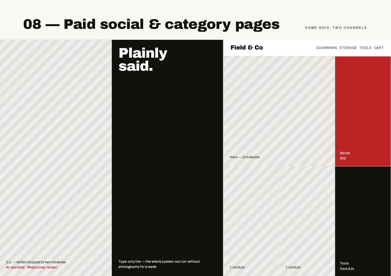
Field & Co deck page 10 — 08 — Paid social and category pages
08 — Paid social and category pages