Campaigns
Ferra
- Client
- Ferra Coffee
- Role
- Identity, Packaging, Social
- Year
- 2026
- Category
- Campaigns
Overview
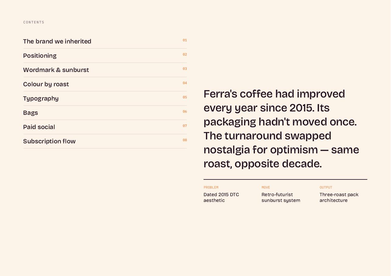
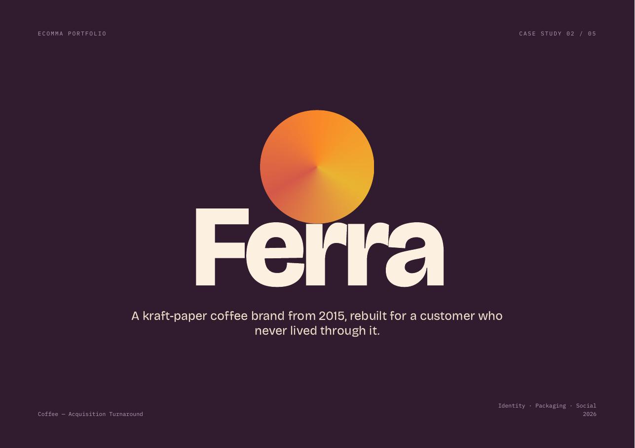
A kraft-paper coffee brand from 2015, rebuilt for a customer who never lived through it.
Challenge
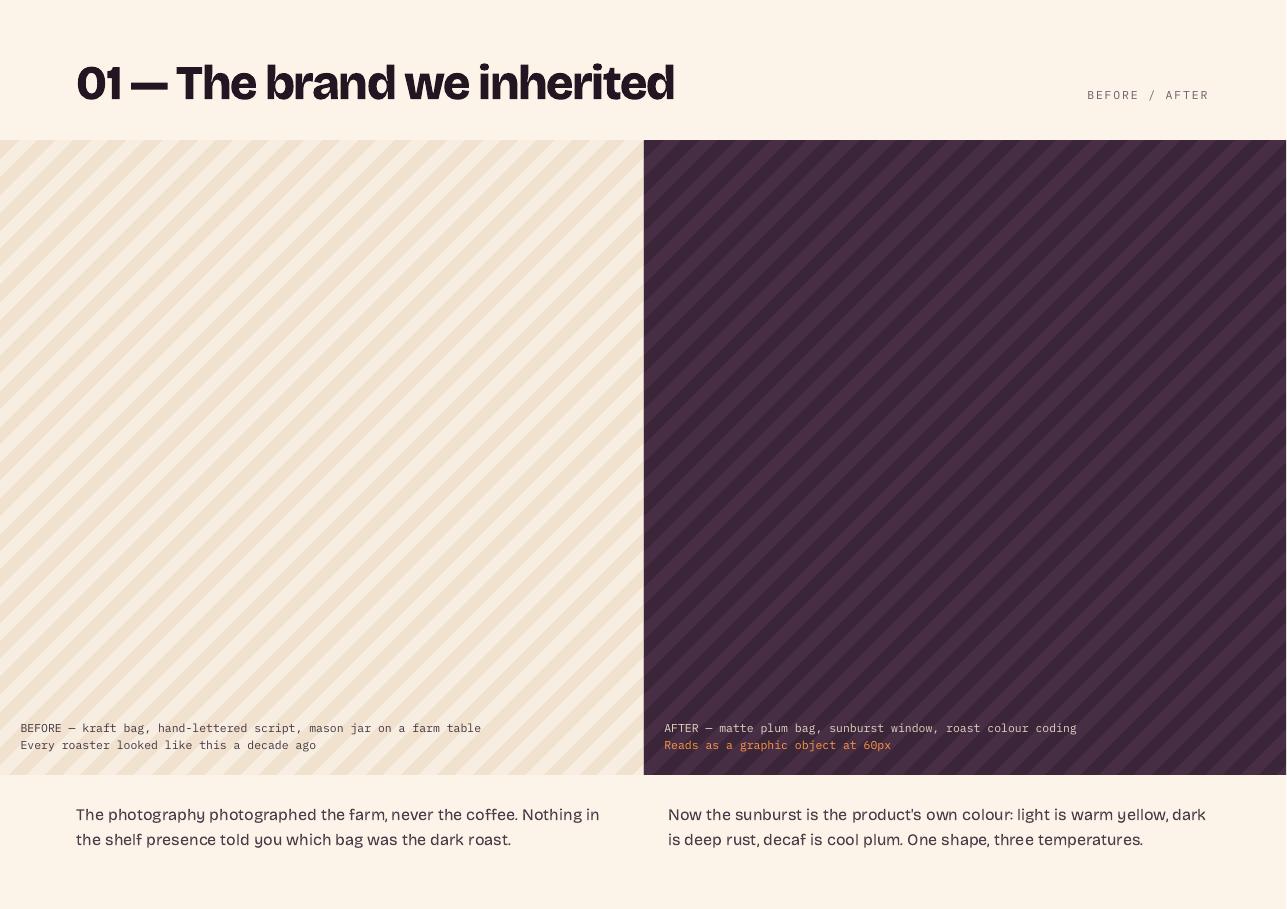
Ferra's coffee had improved every year since 2015; its packaging hadn't moved once. The photography photographed the farm, never the coffee.
Approach
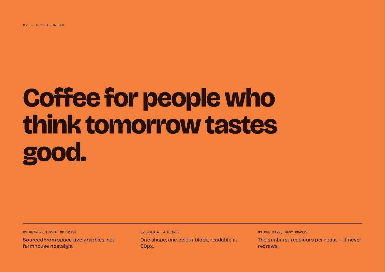
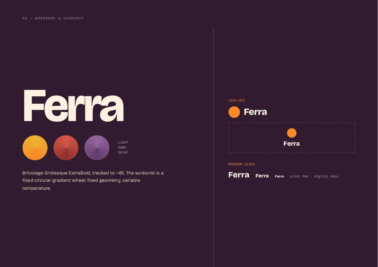
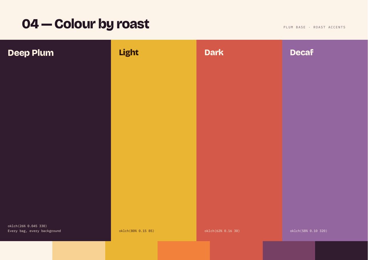
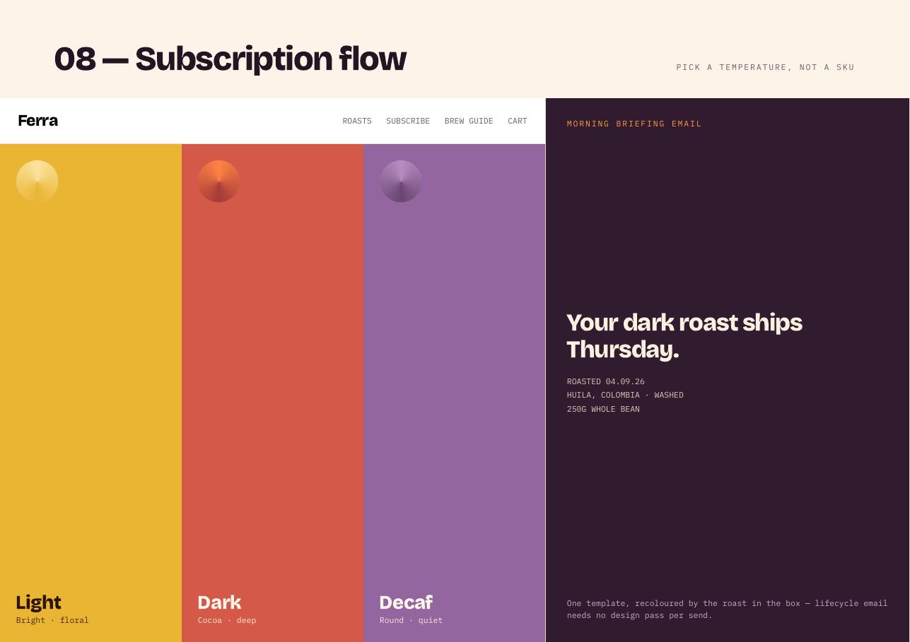
Nostalgia swapped for optimism. A retro-futurist sunburst recolours per roast and never redraws: light is warm yellow, dark is deep rust, decaf is cool plum.
Outcome
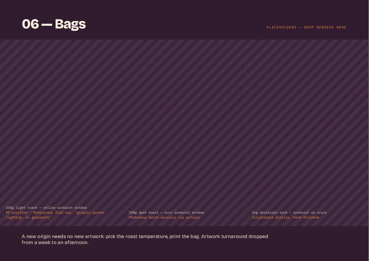
A three-roast pack architecture that reads as a graphic object at 60px, plus a subscription flow that sells a temperature rather than a SKU.